Wednesday, November 19, 2014
Project 11 Deliverable
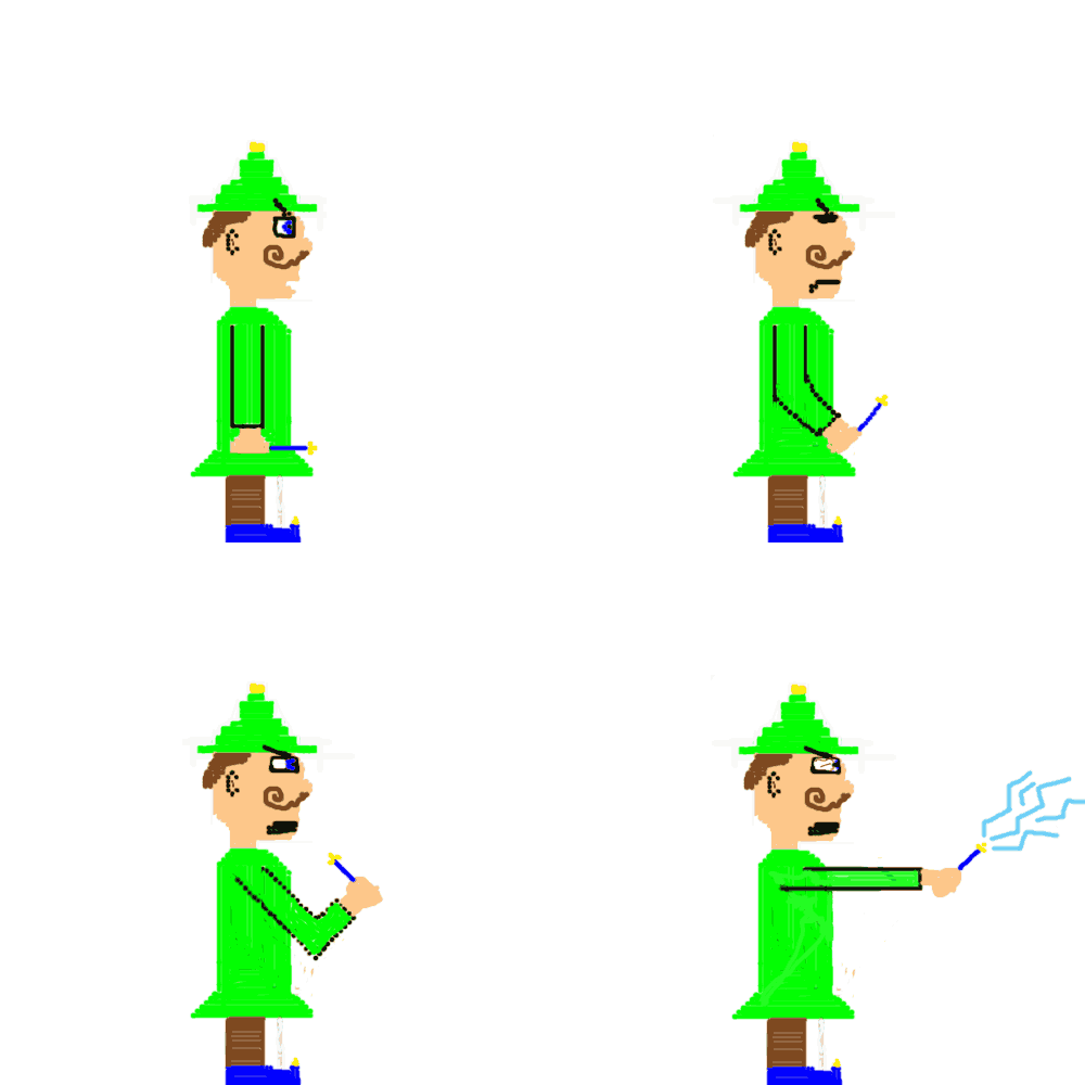
My game is called Wizard Wars, where players can choose a different elemental wizard to battle in arenas with. This particular wizard above is named the nature wizards, and uses the elements, such as lightening to defeat his foes. In Wizard Wars, players battle in an ever changing arena to see who the most skilled wizard is.
links for the other sprite sheets
http://i.imgur.com/Q1OQM.png
http://www.billyzone.com/Other/Mr.GameWatch.gif
http://fc02.deviantart.net/fs71/f/2013/030/0/6/smbz_captain_basilisx_sprite_sheet_by_brawlstudios-d5t9vm6.png
PROJECT 11-Participation
My gifs came out pretty good. The cat in articular looked really good when it was playing fast. However, the sprite sheet I used seemed like it had too much of a space between actions giving the gif a kind of delayed look when played slower. It also felt like some frames could be added as to fill the gap between its movements. Overall, I felt that the squish/shrink effect of the cat's torso gave the gif a realistic look. My running man seemed better in terms of complete frames and movements. Interestingly the angular movement of the torso does not look realistic, yet can be forgiven and actually expected due to the spite's anime like design.
PROJECT 11-Presentation
Derrick Revus
The frames were actually really good looking, with the proper alignments made for head bobs and movement. The body and shape of the gif were all the same, meaning there was no shrinking or growing of the man through each frame. There were no missing frames. The animation looked really smooth throughout the entire movement and punch sequence. While not jerky, I really liked the delay that the character had from the wind-up to punch.
The frames were actually really good looking, with the proper alignments made for head bobs and movement. The body and shape of the gif were all the same, meaning there was no shrinking or growing of the man through each frame. There were no missing frames. The animation looked really smooth throughout the entire movement and punch sequence. While not jerky, I really liked the delay that the character had from the wind-up to punch.
Monday, November 17, 2014
Thursday, November 13, 2014
Project 10 Participation
My cards in particular are lacking a couple things after completion. For one, my mana symbols do not have the specified graphics, and are instead spheres of color. My font could be a little bigger and closer to the font type Wizards uses for the official cards. Finally, my rarity symbol, while the realistic color of a mythic legendary creature, is not very neat and is crudely drawn.
Project 10- Presentation
My magic card has all the necessary attributes of a card. I made sure that the artist (myself) was included, as well as a rarity symbol. Since I chose a legendary creature, the rarity symbol is actually orange, with denotes the creature as higher than rare tier.
Wednesday, November 12, 2014
Tuesday, November 11, 2014
Monday, November 10, 2014
Thursday, November 6, 2014
Monday, November 3, 2014
project 10 partcipation 2
Chris Laferriere
My tile sets were a bit weird with their sizing. While the tiles were all 128/128, some of my assets including ghosts which I drew in Photoshop were too big to detail, and therefore took up two blocks. Water, and Ground tiles also continued three or four tiles in a row which could also prove problematic. The tiles themselves are varied, but it seems like they could only be used to make one level. The tiles are varied, but also only seem to be able to be used in specific ways.
My tile sets were a bit weird with their sizing. While the tiles were all 128/128, some of my assets including ghosts which I drew in Photoshop were too big to detail, and therefore took up two blocks. Water, and Ground tiles also continued three or four tiles in a row which could also prove problematic. The tiles themselves are varied, but it seems like they could only be used to make one level. The tiles are varied, but also only seem to be able to be used in specific ways.
PROJECT 10-Presentation
Derick Revus
Yes, all of his tiles fit in the 128/128 sets, and seem clean and organized. The tiles themselves look nice and varied. The tiles look like they could easily be arranged in different combinations. It also seems that the tiles could also be moved around into a skybox or background, and not just a platforming game. Overall the tiles are varied and creative.
Yes, all of his tiles fit in the 128/128 sets, and seem clean and organized. The tiles themselves look nice and varied. The tiles look like they could easily be arranged in different combinations. It also seems that the tiles could also be moved around into a skybox or background, and not just a platforming game. Overall the tiles are varied and creative.
Subscribe to:
Comments (Atom)
.JPG)
.JPG)


.JPG)


